Sunday, 8 June 2014
A Final Word.
A Final Word.
Well, that's my Contextual Studies Module come to an end. I hope you have enjoyed reading about and/or been inspired by Lucienne Day and Orla Kiely; two exceptional textile artists.
Lucienne Day was a pioneer in the field of pattern design and unconsciously began a movement for female recognition in textiles which continues today with Orla Kiely. Kiely has extended this influence and by building her own business and name as a brand continues to raise the bar for future textile designers achievements.
I believe both their work is an important legacy for the future and will continue to inspire and influence not just textile designers but creators in all artistic genres. ( e.g I have in mind taking some of these patterns and interpreting them as a 3D sculpture with blocks of shaped colours, haven't worked it all out yet. Maybe next year. :-) )
I admire them both for their beautiful colourful designs, for their personal achievements and their belief in themselves.
As for my own personal journey with this blog, I have to admit when I heard about it during the first class, I was terrified and probably looked like a rabbit caught in the headlights. It has been a steep learning curve, having come from a pre-computer age background, and fighting the panic has been a challenge but in the end I have come to be comfortable with this aspect of the digital world. Keeping in mind,with a blog, that I'm having a conversation with others and sharing with them people I admire helped. With the 'How to make' blogs I felt they aided the making process; with the putting things in the right order type of thoughts. Helping others who might want to try making their own creation was also an incentive to get it right.
I hope you have found these artists as interesting and inspiring as I have.
Postscript
I was admiring a friends tesco bag of green and mustard squares and mentioned it was by Orla Kiely and that it was lovely, she very kindly offered it to me. I'm slightly ashamed to say, I accepted without a moments hesitation, now all I need is a piece of Lucienne Day fabric . . . so my next 'post' will be Dear Santa . . :-)
Tuesday, 3 June 2014
An Inspired Piece of Artwork
My Artwork inspired by Lucienne Day and Orla Kiely.
This project is to make a piece of artwork inspired by either or both of the artists in the blogs, Lucienne Day and Orla Kiely. Both of these designers gather inspiration from the everyday objects around them and , in particular, the world of nature. The colours of the seasons and the plant-life they produce.
For my inspiration I have chosen peapods which I love, and not just to eat. The green pods with their little hidden pea gems inside bursting to get out. The curling tendrils and delicate silk-like flowers.
I started scribbling some ideas.


My first step was selecting the paper to work on; I chose brown packing paper ( it had been used as packing round a glass from Ikea). I scrunched it up to give a textured effect.

I painted papers in various shades of green using acrylic paint in Ultramarine and Lemon Yellow. I used a large brush and was quite rough, dragging the paint and leaving the brush marks. Again to give texture and a cloth like appearance.

I painted the crumpled brown paper with acrylic paint in a mix of Raw Sienna and Naples Yellow.

I made sure not to saturate the paper as I wanted the crinkles to stay intact and some of the background natural colour of the paper to shine through.

Leaving all these pieces to dry then requires plenty of patience, a virtue apparently :-)
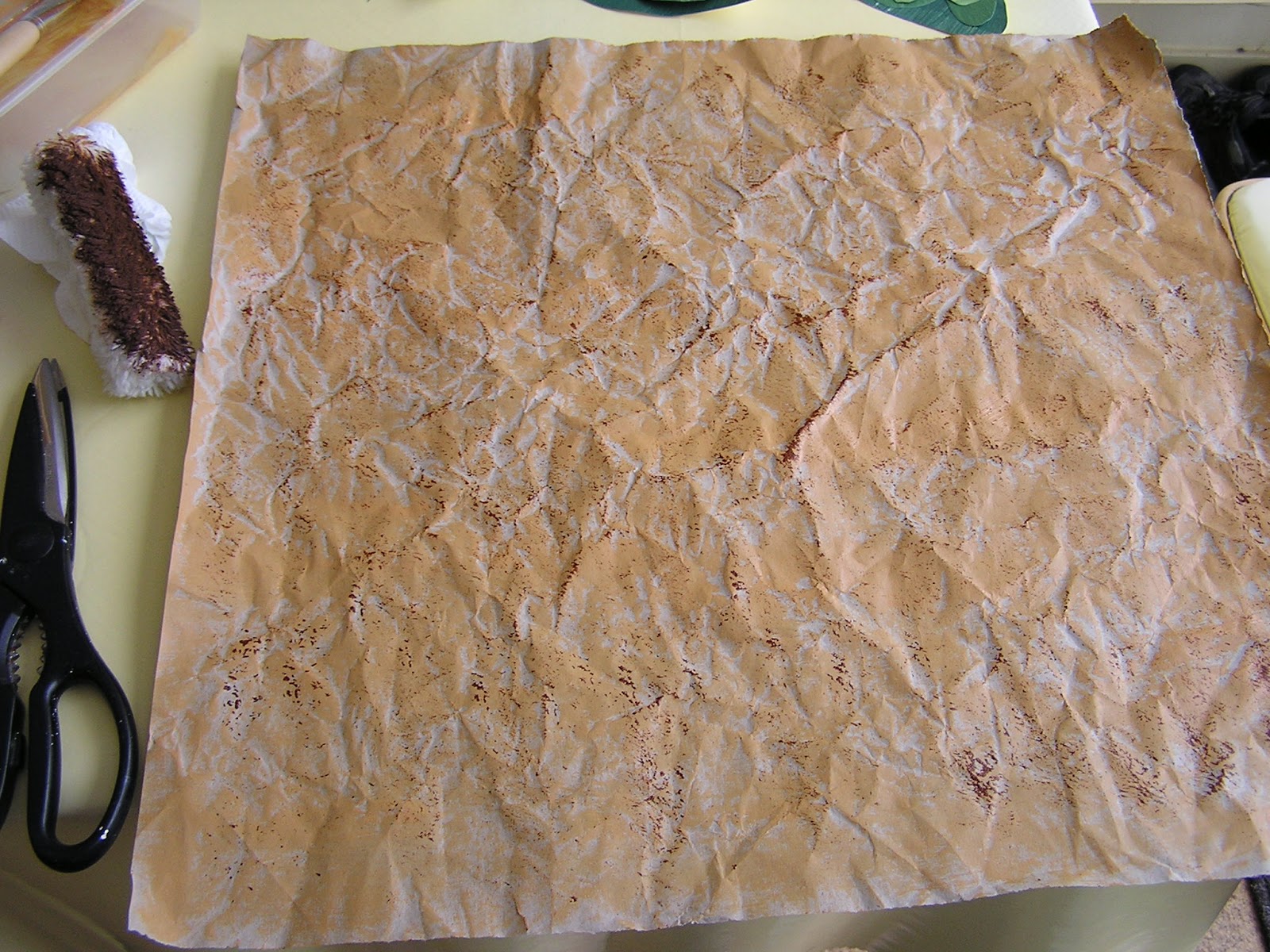
I then added another small layer of texture by painting one edge of a small radiator roller with Burnt Umber and dabbing gently onto the crumpled paper.

Catching the edges of the crinkles gives a dimensional effect.

Using the darkest shade of green paper I drew, in pencil, on the back three individual abstract pea-pod shapes and cut them out. Using the next lighter shade of green paper, using the same method, I cut out individual roundish pea shapes.

This close-up picture of the pod shows the textural effect of the dragged paint.

Using the lightest painted green paper and the same method, I added the next layer of depth to the peas. None of the shapes are the same nor are any of the rounds placed in the same position. This, I feel, keeps the image alive and interesting to the viewer. I have three pods for the same reason as odd numbers are visually appealing.

Again, a close-up showing the painted effects.

After viewing the completed pods, I felt the piece required a little bit of a zing, a bit of brightness. I painted some paper with acrylic paint mixing Lemon Yellow with the merest hint of Ultramarine and added some little highlights to the peas.

Again, a close-up of the piece. As I placed all the components I tried to make sure the paint striations all lay in different directions.

I then made the stems with Burnt Umber coloured paper and the petals using the Yellow highlight coloured paper. For added interest and to give the piece an extra dimension, I inverted the central pod.

After I was happy with the placement of all the individual pieces, I used PVA glue to stick them all together. The whole piece was then placed under a heavy book to aid the pieces staying intact and to stop the edges curling. I then left it to dry.

Once dry, I added the last motifs of curling tendrils using left over light green paper.
Here we have the finished piece.

After all that, I think I'll look for some peapods to eat now.
Replica of an Orla Kiely Pattern.
My Replica of an Orla Kiely Pattern.


A straight cut up the edge of the white felt gave me the vertical lines required. To make the flower template I used a folded piece of card (old christmas card, in fact) and cut out one petal .


Using white thread, sew around edges of flowers and long white strips (stems).

After this is completed, the last piece to add is the central buds which I will stitch with Mercer crochet cotton 40 thread in a peach/pink no 503.


The easiest way to stitch the centres was in a starburst style.
Here we have the finished piece.

This has given me the idea, at a future date, to make the centres yellow, add a few white, thicker, textured threads for more defined petals and turn them into daisies.
Lots of possibilities :-)
Replica of a Lucienne Day Pattern
My Replica of a Lucienne Day Pattern.
This is the image I'll be using for my replica piece.

I took this picture from the book ' Vintage Patterns 1950's by Marnie Fogg, Batsford 2013 where it is listed as pattern name "Ducatoon" but on further research I believe it to be ' Cadenza' which Day produced for Heals 1962. This information, and the following picture, I took from the book ' Robin and Lucienne Day: Pioneers of Contemporary Design' by Lesley Jackson, Octopus Books 2011. As this book is specific to them and the author knew the couple and had access to their archives I believe ' Cadenza' to be correct.

This brown and mustard version is also upside down in Lesley Jackson's book. In any event, I only discovered this peculiarity after I had made the replica blue version. It is still a Lucienne Day pattern and does show, as with many pattern motifs, the versatility of any way being up.
So, to proceed,
I decided to make this image in a collage fashion as , looking closely, the individual pieces lent themselves to being cut-out shapes. The main squares appear to sit on top of the coloured background with rounded corners and unaligned edges.
I painted papers for the blues,lilac and plain browns in shades of various mixtures of Acrylic Paint with Burnt Umber, Raw Umber, Powder Blue, Process Blue, Process Magenta, Phthalo Blue and Black.

For the striated brown paper, I dry-brushed a mix of Burnt Umber and Raw Sienna onto white paper.
I then , using the edge of a wooden knife, printed Burnt Umber and Black lines on top.


Next step was to make up a motif template. The pattern itself consists of an area with 3 x 4 individual blocks.

I cut out the white blobs with white paper first, then the background squares from the coloured papers.


Continuing all the way along the pattern and adding the little inner coloured blobs.

I like to place all the pieces dry to get a feel for the image before committing to the gluing stage.


After making the pattern, I decided to add half a repeat to the right hand side to give a bigger view.

I then had to think about the inky black marks and how to control the repeat image.

I found these items about the house and gave them a wee test.

I used PVA to glue the white blobs and any inner pieces together and, when dry, overprinted them with the button etc and some paint marks.


Once all the pieces had been inked up and dry;

I used PVA to glue all the individual blocks together and then the blocks to the background. I left them to dry under a weight to stop curling edges.

Once dry the completed image is now ready to be framed.

Patterns and Textiles of Orla Kiely
Patterns and Textiles Of Orla Kiely.
Here are a few of Orla Kiely's designs, some used for wallpaper, dress fabrics, crockery, stationary and upholstery. The list is limitless. I believe that the majority of her designs are such, that they can be used in most sizes and on most surfaces.
 |
| Multi Stem Wallpaper (www.orlakiely.com) |
 |
| Multi Stem in Seagreen Wallpaper (www.orlakiely.com) |
It is a very versatile pattern, as each year she produces a new version, for example in colourway, a textural effect in the leaves or plain outline stitchery especially on bags. It is a simple motif but extremely effective and instantly recognisable. I personally enjoy the seagreen colourway version more as I feel it has a calming quality as opposed to the brighter original.

Multi Stem Canister ( wwww.ebay.co.uk) Multi Stem Mini Task Lamp (www.orlakiely.com)
This next pattern is also a single motif;-
 |
| Acorn Cup Wallpaper (www.orlakiely.com) |
 |
| Acorn Cup Phone Cover, ( wwwtotaldigitalstores.co.uk) |
This motif is in a similar vein to Multi Stem. It works well visually for the same reasons and would be extremely effective reduced to the smallest size, as a repeat pattern for a dress, whereby the actual motif would not emerge to the eye until one was particularly close. For what appears quite a busy pattern, with very little background on show, the circle cup draws in the eye.
 |
| (www.orlakiely.com) |
Even though this version is red , I happen to like it, and find it quite cheery. I think the blue spots dampen down the brightness and makes it more to my taste. It is a continued surprise how the look of a pattern and what one feels about it, alters when the colour combination is changed. I think this is very important to keep in mind for all art projects in order not to dismiss a piece of work by mistake.
 |
| Alpine Forest print raincoat A/W 2006 ( my photo from her book . .pattern - orla kiely, Octopus Books) |
 |
| Alpine Forest print in ruby A/W 2006 ( my photo from her book . . pattern - orla kiely, Octopus Books |
This is a simple motif made more interesting by the placement of the overlapping shades in the tree shapes and I certainly wouldn't mind the raincoat in it's lovely mustard yellow tones. The choice of red for the dress makes it quite noticeable and 'shouty' whereas the raincoat colour recedes and is more demure.
 |
| Aerial View print in Glade A/W 2009 ( my photo from her book . pattern-orla kiely, Octopus Books) |
 |
| Boat Sketch print in Charcoal S/S 2010 ( my photo from her book . pattern- orla kiely, Octopus Books) |
 |
| close up of above |

 |
| Colourblock print in Walnut for a Special Project for Tate Galleries 2008 ( my photo from her book . pattern-orla kiely, Octopus Books) |
 |
| Striped Petal pattern on book cover. (My photo from her book pattern-orla kiely, Octopus Books) |
 |
| Striped Petal pattern on dress S/S 2008. (My photo from her book pattern-orla kiely, Octopus Books) |
These photos show the different uses for the same motif.
 |
| "Flower Blossom" pattern on a skirt. ( My photo from her book pattern-orla kiely, Octopus Books) |
 |
| "Flower Blossom" Pattern on a duvet. (My photo from her book pattern-orla kiely, Octopus Books) |
The versatility of her patterns is remarkable, again and again these motifs transfer easily from one situation to another, as you can see above.
 |
| Beach Flora Print in Sea Green S/S 2010 (My photo from her book pattern-orla kiely, Octopus Books) |
I do like her work and, even allowing for the differences in peoples personal colour preferences, I believe, her work will endure and continue to evolve.
Subscribe to:
Posts (Atom)